Data & Sons Logo
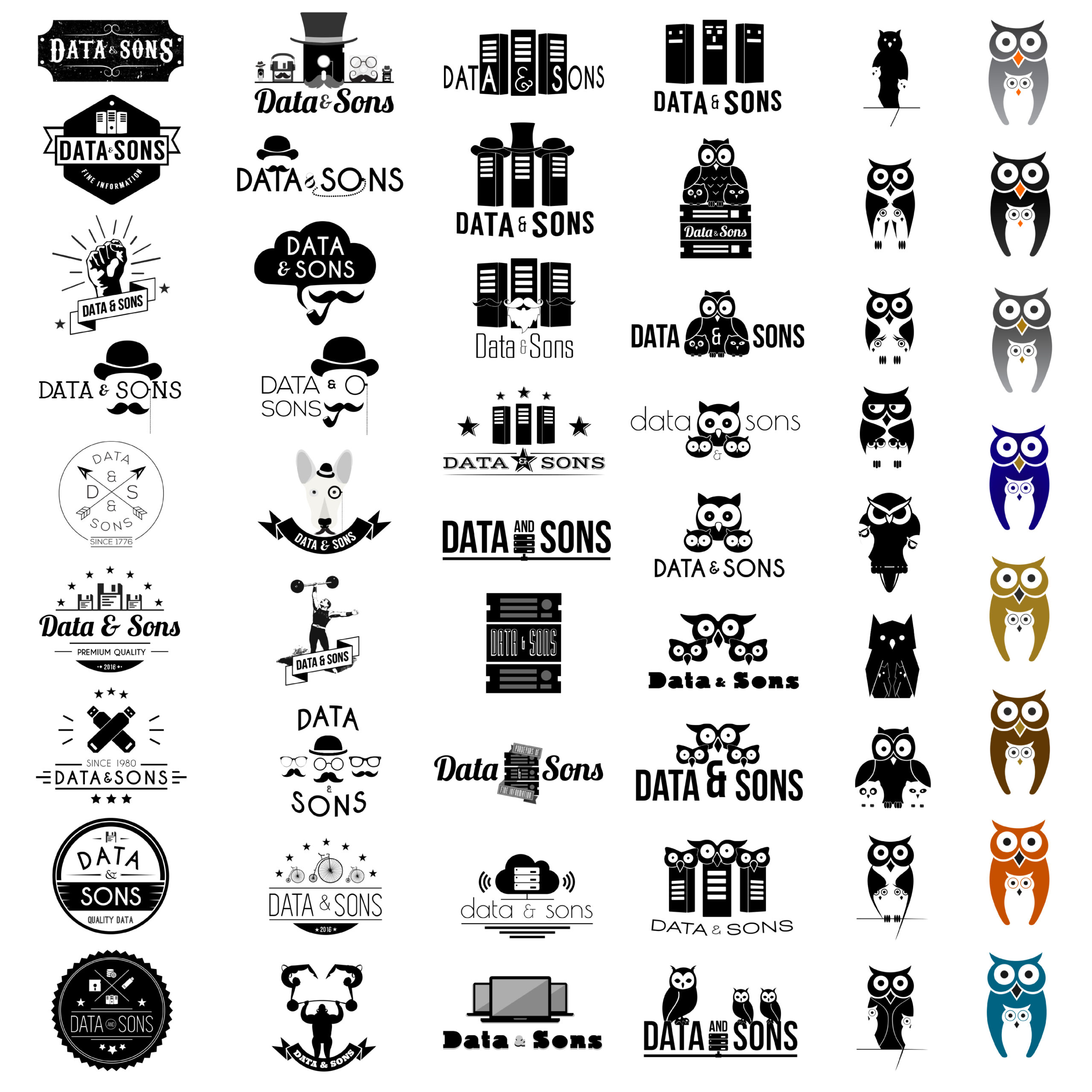
Data & Sons wasn’t sure what they wanted their logo to look like. The iterative design process helped the founders narrow down themes, styles, and design elements. What started off as a series of hipster wordmarks gradually became the company’s current logo.
If you’d like to see the logo iterations, click on the image below.
